Application Design I - Task 3: Low Fidelity Prototype

27/10/2023 - 10/11/2023 (Week10 - Week12)
Teoh Gim Khoon (0361563)
Bachelor of Design (Hons) in Creative Media
Task 3 - Low Fidelity Prototype


Link to others tasks
Task 1 - Project Proposal
Final Project - High Fidelity Prototype

INSTRUCTIONS


Go To Section

Task 3 - Low Fidelity Prototype
Visual Design Concept
Research Study
Fig.1: Research wireframe study by balsamiq
To create a wireframe for mobile application design, I start by exploring the subject in depth. This involves conducting thorough online research to gain valuable insights and knowledge on the precise steps and optimal methods involved in the process. By doing so, I can ensure that the wireframe is well-structured and meets the needs of the target audience.

Color Schemes
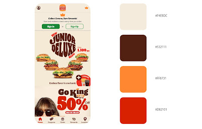
Fig.2: BK corporate color
To ensure a cohesive and recognizable visual identity, I’ve decided to use Burger King’s corporate brand colors as the center of the application’s color scheme. This decision reinforces the brand’s identity and values, while also projecting professionalism and consistency across all brand touchpoints.

The wireframe design employs three different shades of grey: dark, mid, and light. These shades are strategically organized to emphasize prominent elements or primary actions with darker shades, while mid-tones are applied to normal content and standard buttons. Lighter tones are designated for secondary elements or less critical information.

Typography
Fig.3: Typography Selection
In my app redesign, the selection of typography involves distinguishing between primary and secondary fonts to create a unified visual identity. The primary font, Flame Sans, is inspired by the iconic font of the original Burger King, chosen deliberately to evoke a sense of heritage and authenticity. Secondary font, Montserrat, is carefully chosen to enhance readability and maintain visual harmony across the interface.

Flame sans, prominently featured in titles and headings throughout the app. Its deliberate selection aims to convey a strong brand presence. Montserrat, extends to body text, captions, and other supporting elements within the app. The combination of Flame Sans and Montserrat ensures a balanced and aesthetically pleasing typographic hierarchy, contributing to a positive user experience.

Navigation Icon
Fig.4: Icon Selected
Application design incorporates a wide range of icons that are both visually appealing and easily comprehensible. I have thoughtfully chosen these icons through plugins such as Iconify and Streamline Icons. These plugins offer a diverse and user-friendly selection, ensuring that  icons are not only aesthetically pleasing but also intuitive to navigate. By keeping things simple, aim to enrich the overall user experience within the application.

Moodboard

Wireframe Progress
Sketch
Fig.5: Wireframe Sketches Progress
Before immersing myself in the wireframe design process with Figma, I begin by sketching rough ideas to gain a clearer understanding of the app's structure and flow. This initial hand-drawn phase enables me to develop a preliminary sense of the design, make swift assessments, and implement any necessary adjustments on the spot to achieve the final polished design.

UI Component

After finalizing the sketch with all design elements, I transitioned to Figma to create UI components. This step aims to ensure design consistency and streamline the prototyping process by making interactive and reusable elements. This approach enhances visual unity, simplifies maintenance, and supports the evolution of the design.

Wireframe Prototype
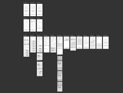
Fig.6: Wireframe Prototype
Following the initial sketching phase, I move into the wireframe design using Figma. In this stage, I craft the design for each page, incorporating not only the fundamental elements but also integrating the main features essential to the functionality of the application. Additionally, I consider and include supplementary features within the design to enhance the overall user experience.

Onboarding Page
Fig.7: Onboarding Wireframe Design
The Onboarding Page marks the user's initial encounter with the Burger King app. It's meticulously crafted to provide a smooth and engaging experience for new users, gently guiding them through the setup process. This page may incorporate captivating visuals, a concise introduction to the app's core features, and a straightforward registration or login option.

Registration Page
Fig.8: Registration Wireframe Design
The Registration Page is where user start their journey with the app or log in if they've been here before. User just need to share some basic info like your name, email, and password. The idea is to make it easy to get started while making sure your data stays safe and private.

Home Page
Fig.9: Home Wireframe Design
The Home Page is like the main spot in the Burger King app. It shows user a quick view of important stuff like special deals, top menu items, and easy links to important sections like ordering, the menu, and rewards.

Menu Page
Fig.10: Menu Wireframe Design
The Menu Page is like a food paradise for Burger King fans. It's where user can happily explore all the different tasty options they have. The page is well-organized, showing categories, specific items, and detailed descriptions, making it super easy for user to go on a delicious culinary journey.

Order Customization Page
Fig.11: Order Customization Wireframe Design
The Order Customization Page lets user take control of their meal. User can customizer their food just the way they want it—pick ingredients, choose portion sizes, and make it uniquely. The aim is to make ordering easy and personalized, so everyone gets a meal that suits their taste buds.

Order & Payment Page
Fig.12: Order & Payment Wireframe Design
The Order & Payment Page is like the main hub of the app. Here, users pick out what they want to eat and easily pay for it. This well-thought-out page gives a straightforward summary of the order, making sure user know exactly what they are paying for and offering different secure ways to pay.

Rewards Page
Fig.13: Rewards Wireframe Design
The Rewards Page in the Burger King app is all about appreciating loyal customers. It's loaded with rewards and bonuses to honor those who stick with the app. This special page is like a goldmine of info, laying out the Burger King rewards program, showing off user earned points, pointing out ongoing promotions, and revealing exclusive perks just for user.

Profile Page
Fig.14: Profile Wireframe Design
The Profile Page in the Burger King app is like a control center for users. It's where user handle their account settings, check out order history, and get personalized recommendations. It's a handy space that lets user stay in charge of the experience, making user feel more connected and involved.

Final Wireframe Design

Usability Testing
To gather valuable feedback on the usability and user experience (UX/UI) of the redesigned Burger King app, a user testing session was conducted. Utilizing Figma's prototyping tool, participants were guided through a series of tasks and then asked to respond to eight feedback questions. The insights gathered from this testing will be instrumental in further refining the app's design and enhancing the overall user experience.

Usability Testing Task
Task 1 (Registration)
Create a new account on the Burger King app. Provide necessary information such as your name, email address, and create a secure password. Once the account is created, take note of any challenges or observations during the process.

Task 2 (Order a burger - Delivery)
Navigate through the app to find your favorite burger and place an order for delivery. Pay attention to how easy it is to browse the menu, add items to your cart, and specify delivery details. Note any issues or improvements in the ordering process.

Task 3 (Customization order)
Customize a burger according to your preferences. This could include selecting toppings, adjusting portion sizes, or modifying any other customizable options available. Evaluate the intuitiveness of the customization features and report any difficulties or suggestions for improvement.

Task 4 (Place Order & Payment)
Proceed to check out and complete the payment for your order. Evaluate the payment process for clarity and ease of use. Take note of any issues encountered or any concerns related to payment information input.

Task 5 (Review Order History & Reorder)
After completing a transaction, navigate to the order history section. Review your recent order and explore options for reordering. Provide feedback on the visibility of order history, the simplicity of the reorder process, and any additional features you find useful or lacking.

User Feedback
Fig.15: Usability Testing Q&A Feedback 

Fig.16: Individual User Testing Text 

Common Positive Feedback
Visual Appeal and User-Friendliness:
  • Positive comments on the contemporary aesthetic and user-friendly design.
  • User find the layout well-places and easy to navigate, contributing to a fun and seamless experience.
  • Good integration of icons and text for a cohesive look.
Ordering Process:
  • The ordering process is straightforward and enjoyable.
  • Clear options for delivery and pick-up, with seamless customization features.
Navigation:
  • Positive comments on the ease of navigation, aided by features like a navigation bar and a 'previous' button.
  • Users find it easy to move around the app and accomplish tasks seamlessly.
Integration of Icon and Text:
  • Praise for the integration of icons and text, enhancing the overall user experience.
  • Icons contribute to a clean and organized appearance, saving users time.

Areas for improvement
Text and Font Size:
  • Consistent feedback about some sections having small text size.
  • Suggestion to increase the font size for better visibility, especially for users with potential readability issues or visual impairments.
Accessibility:
  • Consideration for the comfort and readability of users, especially older individuals or those with eyesight issues. 
  • Increasing the overall font size to enhance accessibility and appeal to a wider audience.
Interface Clarity:
  • Some users recommend labeling customization pages more clearly and using progress bars during the ordering process for improved clarity.
Visual Overwhelm:
  • Feedback on feeling overwhelmed in the customization page due to excessive text and a lack of images for ingredients. Suggestion to balance text and visuals.


Low Fidelity Prototype

Final Task 3 - Low Fidelity Prototype


FEEDBACK
Week 12
  • Create UI kit components for all elements to enhance the efficiency of the prototype.
  • Ensure consistency and streamline the design process by incorporating UI kit components.


Week 13
  • Overall, the prototype design is commendable.
  • Suggestion: Replace placeholder text (Lorem Ipsum) with actual sentences for a more realistic and meaningful representation.
  • Opt for actual sentences instead of lines to improve the prototype's clarity and authenticity.


REFLECTION

In the course of developing this low-fidelity prototype, I acquired valuable insights into utilizing Figma software for the creation and design of application UI interfaces. While I had some prior experience with Figma, this project significantly enhanced my familiarity and proficiency with the tool. Working on this project allowed me to become more accustomed to Figma's features.

Throughout the use of Figma in this project, I gained knowledge on efficiently creating UI components to streamline the design process, making it both easier and quicker. Additionally, I learned the importance of crafting a well-structured wireframe as a preliminary step before progressing to the high-fidelity prototype design phase. Overall, this experience has deepened my understanding and competence in leveraging Figma for UI design.

Comments